How to Make a YouTube Thumbnail With AI (That People Actually Click)
A practical workflow for making YouTube thumbnails with AI: size and safe areas, generating the background and your face shot, adding text by hand, and the design rules that make a thumbnail readable at small sizes.
To make a YouTube thumbnail with AI, generate the image parts (a background scene, a clean shot of you or the object) with an AI photo tool, compose them at 1280 × 720, and add three to five words of text by hand in a design tool. AI handles the visuals quickly; you keep control of the words, which is the part AI still gets wrong most often.
A thumbnail is not a poster. It is seen at the size of a postage stamp on a phone, next to a dozen others. Everything in this guide follows from that.
Step 2: Get a strong shot of your face (or your subject)
If your thumbnails feature you, you need a clear, well-lit photo with a readable expression. Options:
Use a frame from your video, then upscale it and clean the background.
Take a dedicated photo against a plain wall in window light, making the expression you want.
Use an AI headshot tool to improve lighting and background from a photo of you, while keeping your likeness.
Expressions that read at small sizes are simple and clear: surprise, curiosity, a smile, concentration. Subtle expressions disappear.
Cut the subject out or replace its background so it sits cleanly on your thumbnail background; our background replacement guide covers this. If the frame is soft, AI upscaling helps.
AI-generated lettering still misspells, distorts and mis-kerns. Add it yourself:
Three to five words. Complement the title rather than repeating it.
One bold, heavy font. Thin fonts disappear at small sizes.
High contrast. White or yellow on dark, dark on light. Add an outline or shadow if the background is busy.
Big. Text should take up a large share of the height.
Away from the bottom-right, where the timestamp sits.
Any design tool works: Canva, Figma, Photopea, Keynote, or a phone editor.
Step 4: Test at real size
Before you publish:
Shrink the thumbnail to about 160 pixels wide. Can you still tell what it is?
View it in dark mode and light mode.
Put it next to thumbnails from your niche. Does it stand out, or blend in?
Check the bottom-right corner is clear.
Design rules that make thumbnails work
Contrast beats detail. Bold shapes and colour differences read at any size.
Faces should be large. Head and shoulders, filling a third or more of the frame.
Limited palette. Two or three main colours.
Consistency. A recognisable style across your channel helps returning viewers spot your videos. Our guide to consistent AI avatars across platforms has tips that apply to thumbnail styles too.
Honesty. A thumbnail that promises something the video does not deliver hurts retention and trust.
Thumbnail layouts that work
Most effective thumbnails use one of a handful of layouts. Picking one before you generate anything tells you where to leave empty space in the background prompt.
Face and text split. Your face on one side, three to five words on the other. The most common creator layout, and easy to keep consistent.
Object hero. One product or object, large and centred or slightly off-centre, on a clean background. Good for reviews, unboxings and tutorials.
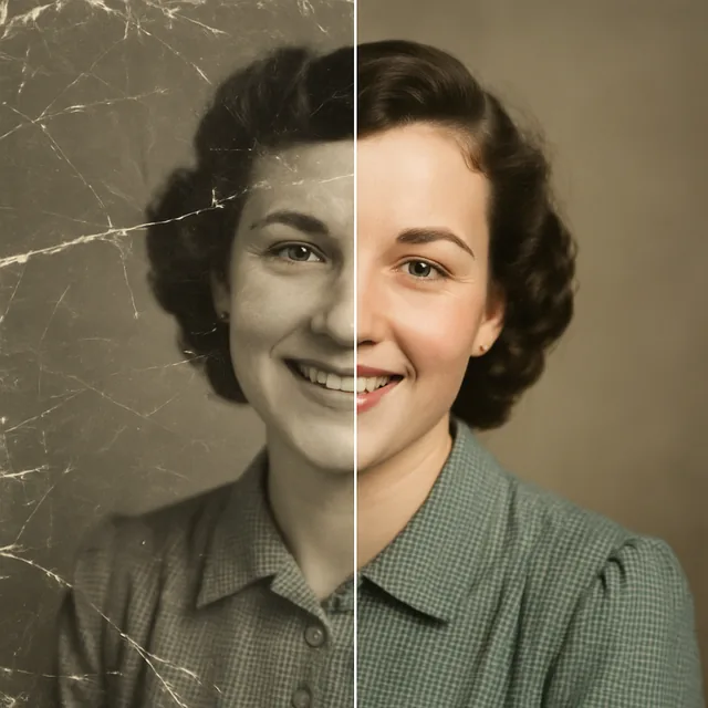
Before and after. Two halves of the frame showing a change: a messy room and a tidy one, an old photo and a restored one. The contrast tells the story without many words.
Reaction plus object. Your face reacting to something shown next to you. Works when the object is the point of the video and your expression adds the hook.
Scene only. A striking location or moment with a short line of text. Common for travel and documentary-style videos.
Once you know your layout, add it to the background prompt: "empty space on the left third for text", "clean centre area for a product", "split composition, left side darker".
Colour and contrast choices
Contrast is what makes a thumbnail readable when it is small. Some practical guidance:
Separate subject from background. A dark background with a well-lit face, or a bright background with a darker subject. Similar brightness on both makes them blend.
Use complementary colours sparingly. Blue and orange, purple and yellow, or green and magenta create strong contrast. One accent colour for the text is often enough.
Think about YouTube's own interface. Thumbnails sit on a white or near-black page depending on the viewer's theme. Very dark or very white edges can merge with the page, so check both.
Add a subtle edge light or glow around your cut-out subject if it gets lost. Asking for "rim light" when you generate your face shot does the same job naturally.
Making a repeatable template
If you publish regularly, a template saves time and builds recognition. Once one thumbnail works:
Save the layout in your design tool with the text box, font, colours and any outline or shadow already set.
Keep your prompt wording for backgrounds in a note, changing only the subject each time, such as "clean dark desk with soft blue rim light" becoming the same scene with a different product.
Build a small library of face shots with different expressions, taken or generated once, so you are not starting from scratch for each video.
Keep the text position fixed so viewers learn where to look.
A template does not mean every thumbnail looks identical. The subject, expression and words change; the structure stays.
Testing and improving over time
A thumbnail can be changed after a video is published, and YouTube Studio shows impressions and click-through rate for each video. Use these as rough signals rather than precise verdicts, since results depend on topic, timing and audience as well as the image. YouTube has also offered a built-in way to test more than one thumbnail on some channels; check YouTube's help pages for what is currently available to you.
Useful habits:
Change one thing at a time, such as the text or the expression, so you can see what made a difference.
Give a change time before judging it; a few hours of data is rarely enough.
Compare against your own channel, not other creators' numbers.
Mistakes to avoid
Letting AI write the text. Always check spelling or add it yourself.
Clutter. Arrows, circles, emojis and five objects at once become noise.
Misleading images. Fine for a mock-up, not for the final thumbnail if it misrepresents the video.
A quick workflow summary
Generate a simple background with empty space, no text.
Get a sharp, expressive shot of you or the subject; clean the background.
Compose at 1280 × 720 with a large focal point.
Add three to five bold words by hand.
Test at stamp size, then publish.
You can generate backgrounds with text to image and improve your face shot with the AI headshot and change background tools in the browser studio. For more creator workflows, see AI video trends every content creator should watch.
Frequently asked questions
What size is a YouTube thumbnail?
YouTube recommends 1280 × 720 pixels, a 16:9 ratio, with a minimum width of 640 pixels. Keep the file within YouTube's size limit and use JPG or PNG. Check YouTube's help pages for the current limits.
Can AI make a whole YouTube thumbnail?
AI is excellent for the image parts: backgrounds, a clean shot of your face, objects and scenes. It is still unreliable at text. The best workflow is to generate the images with AI and add the title words yourself in a design tool.
Should I put my face on my thumbnail?
Many creators do, because a clear face with a readable expression draws the eye. It is not required, though; tutorials, product videos and many niches do well with an object or scene instead. Test both on your own channel.
Is it okay to use AI images in YouTube thumbnails?
Generally, yes, but the thumbnail must represent the video honestly. Misleading thumbnails can breach YouTube's policies and hurt viewer trust. Also avoid using other people's faces or trademarked characters without permission.
How many words should a thumbnail have?
As few as possible, usually three to five. The title already carries the detail; the thumbnail's text should add a hook or context the title does not.
Ready to put this into practice?
Create with Kitana using the tool that fits this guide.